The Milk Run
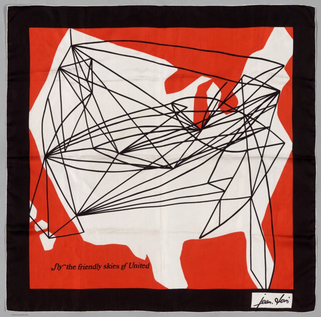
Recently, I was returning from the lower 48 on a commercial jet, admiring the back of the in-flight magazine where they print the air route maps. You know the maps – the one where neon blue arcs crisscross the continent or globe, as if the trajectory of the aircraft was like a ball, bouncing from place to place. It accentuates the Golden Age-feel of flying, evidenced in that privileged understatement of “puddle jumping across the pond” to show the long arc between London and New York City.

Although the arc height is exaggerated for the purposes of display, these arc maps (see what I did there?) have a term: radial flow maps.
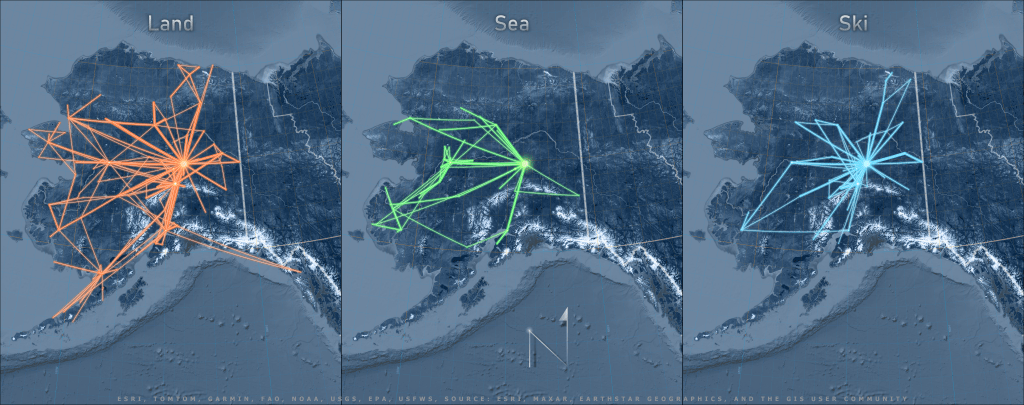
As I have stated before, one of my goals in this blog is to put Alaska back on the map. Given how large the state of Alaska is, I thought a similar map would work well when displaying flight tracks as crisscrossing the state and as a pilot myself, I even had my own aviation dataset in the form of a pilot logbook!
But I’m still a baby pilot in the grand scheme of things and my logbook is short, both spatially and temporally. I needed a dataset that covered long distances, so I used my partner’s logbook, which at the time had about 3,500 hours of travel logged throughout the state.
This blog post talks about the cartographic principles and GIS workflow behind creating this map of Alaska air routes with real-life* flight data from a fixed wing using wheeled gear, floats, or skis.
Projecting
Before I get into the how I made the map, I have to explain a little bit about what makes these maps appear as they do: map projections and geodetic features.
Map projections are a seemingly simple concept that can get real complicated, real quick. Most people understand the need to take a round object, such as the earth, and manipulate it to look flat on a plane (no, not that kind of✈️ ). From there, it gets a bit more complicated, but suffice to say, every type of projection is designed to minimize distortion in some field, be it shape, area, distance, or direction.
Although most of us can appreciate the dilemma of charting a 3D globe onto a sheet of paper, it is another thing to put ourselves in the shoes of those who came before the digital era of virtual globes, GIS software that does datum transformations and on-the-fly projections, and GNSS equipment. With all of these tools in our hands, it is easy to overlook how a map user’s needs as well as the limitations of the medium played such a large role in determining a map’s projection.
Objective, Projective!
Although the purpose of my map is to display arcs, it helps to understand the design basis for most aeronautical (and marine) charts, as well as how the objective of navigating courses with a chart differs from the objective of displaying lines on a map.
In the case of these air route maps, what gives the line it’s curve is that it is a “geodetic feature“. There are a few types of geodetic features. The two we care about most in this context are:
- A rhumb line (loxodrome), which is a constant bearing line, meaning that you won’t have to change compass bearings when navigating from Point A to Point B (magnetic declination not withstanding). When a rhumb line is displayed on a cylindrical projection, it can appear as a straight line. But when projected on almost any other type of projection, it appears curved, since it is in fact, a longer route to take.
and
- A great circle is a type of geodesic line that, if drawn around a sphere, would segment the sphere into equal halves (for the simple purposes of this discussion). It is the shortest distance between two points, but requires changing bearings constantly to navigate from Point A to Point B. A great circle appears straighter on a planar and conic projections, but appears curved on maps in the cylindrical projection.
In other words, if you care about finding the shortest line from point A to point B, you would measure your distances on an equidistant map using a projection type that minimizes distortion in your area of interest. If you care more about plotting a constant bearing than you care about the distance traveled, you might choose a map for navigation that displays constant bearings as straight lines, such as – drumroll please – a Mercator Projection!
A Word about Poor Mercator
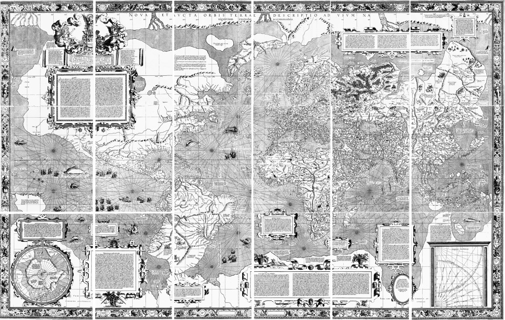
I have to admit, when I hear people talking poorly of the Mercator projection, independently and apropos of nothing, I do pass judgement on their understanding of cartography or their navigational experience. In my book (and another book, one actually written on this subject)1, Gerard Mercator made famous one of the most useful projections of our time with his atlases and his vision for a type of map that would make navigation easier, at least in theory, if not in practicality, for a few more centuries.
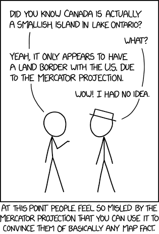
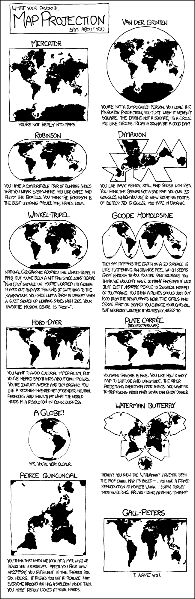
Mercator Projection, by xkcd
Let none dare to attribute the shame
– Deetz and Adams, 19451
Of misuse of projections to Mercator’s name;
But smother quite, and let infamy light
Upon those who do misuse,
Publish or recite.
Students of marine navigation are familiar with using plotters, compasses, and dividers to calculate bearings and distances along a chart, and as such, have an appreciation for what the Mercator projection affords them: straight rhumb lines which mean less work.
Unfortunately, Mercator’s projection became so popular among worldly mariners, that it was adopted globally when displaying global extents, which has lead to misapplications (and misunderstandings) worldwide.
One of the biggest technical complaints about the Mercator projection is the areal distortion that grows infinitesimally larger as one nears the poles. But even Mercator himself recognized this limitation, and included a polar aspect planar projection in the inset of his original world map.3
Like so many projections, the problem with Mercator isn’t a problem with a projection as much as misapplication.
What most people don’t know is that the real atrocity of a projected coordinate system is WGS 84 Web Mercator (auxiliary sphere), which distorts shapes, areas, distances, rhumb lines, angles, directions, and bearings. And yet, almost every mapping app used by the general public uses this projection and you rarely hear people groan about that!
Aviate, Navigate, Communicate, Present-ate
We’ve briefly touched on the advent of a projection that will display rhumb lines as straight and great circles as curved to meet the needs of navigation. Now let’s come back to the opposite idea of a projection that will display great circles as straight lines and rhumb lines as curved.
Although U.S. aviators started out with Mercator projections like marine charts (and there were strong advocates for remaining with Mercator4), they eventually moved towards a locally secant Lambert conformal conic projections1, which meets the ICAO requirement of displaying great circles as (mostly) straight lines. There are many different types of aeronautical charts these days, each covering different scales and regions for different purposes, such as flying under visual flight rules or instrument flight rules, but for today’s lesson, let us focus on the sectional chart at a 1:500,00 scale published by the FAA.
As stated before, the distances of a great circle are less than those of a rhumb line when plotting the same points, but it is in the eye of the traveler if this trade-off is worth it.
When planning a VFR cross-country flight using a sectional chart, I would use pilotage to plot my course. Meaning I would identify visual checkpoints between my origin and departure along my path, (which could really only be about 320 miles with the Super Cub on a good day). Compensating for the curvature of the earth isn’t really that big of an issue at short distances.
What about long distances? To travel from the village of Wales to Metlakatla, the difference between the rhumb line and the great circle would be roughly 18 miles, which is only about 1% of the total 1,418 miles traveled. Would tacking on an extra 18 miles make or break you? Or would recalculating your course every 100 NM make or break you?
Maps are made to look at, charts [are made] to work on.
-Old adage, adapted from Capt. G.S. Bryan4
One final word on the differences in navigational needs vs. map displays, and projections with geodetic features: for the end user of a chart today, it may be a moot point.
I use Foreflight, an electronic flight bag that serves as a moving map, flight planner, logbook, GPS data logger, etc. and is pretty much the coolest thing to arrive on the flight scene since the artificial horizon. Foreflight uses an orthographic projection (I think), which displays lines as straight at a large scale but when zoomed out to a small-scale, it is easy to see the curve of a long flight line.
This is all well and good for the maps, you may say as I did when I first started using Foreflight, but how then does Foreflight determine the bearings for navigation if the course is a great circle? Foreflight generates a NavLog that breaks down the flight plan into 100 NM segments to calculate the course and distance (let’s save magnetic north and winds aloft discussions for another day).
So what you see on the map isn’t technically what you get for navigation with today’s technology.
Workflow of a Radial Flow
By now you should have a taste of the differences in map projections and how each displays a geodesic feature and how each type of projection and feature has their place in navigation and displays. This knowledge will help us move forward as we work on our radial flow map to meet my ultimate objective: map a pretty map with curved flight lines.
But first, the dirty work.
Data Clean-up
In the Esri examples of radial flow maps, each author begins with an immaculate dataset of air routes (or at least point-to-point data), which of course is not how data exists in the wild. After I had convinced my boyfriend to share his logbook with me (and you), I had to clean up the data before I could use it.
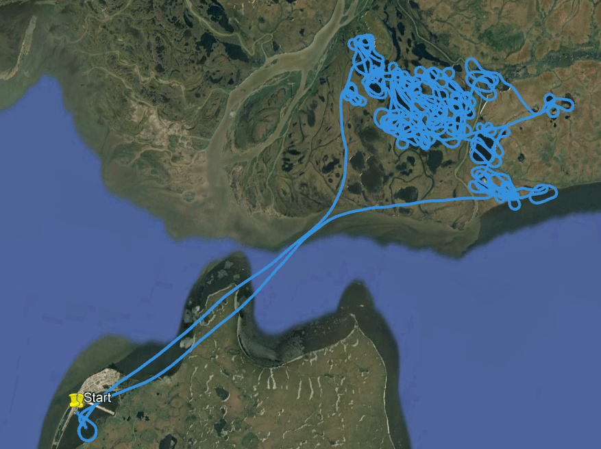
Although Foreflight allows us to log and then export our GPS tracks for each flight, my goal with this project wasn’t to show an exact ground track, but instead to show the point-to-points arcs. Besides, there is no batch export for GPS tracks from Foreflight, making the extraction of 3,500 hours worth of GPS data a daunting task. Additionally, pilots who fly wildlife surveys spend most of their time circling animals and birds in remote areas without ever landing before returning to their point of departure.
After I exported Brett’s logbook in text format and cleaned it up in Excel, only about half of the logbook contained unique identifiers for the start and end locations, or included unique, identifiable sites between the departure and destination sites. The unique identifiers came in four flavors: 1) The ICAO identifier (e.g., PAFA), 2) the FAA identifier for smaller airstrips (e.g., 5ZS), 3) a set of lat/long coordinates, and 4) a local place name (e.g., Kantishna).

For example, when traveling between Fairbanks (PAFA) to McKinley Park (PAIN), or when starting and ending in PAFA, with a stop in Nenana (PANN), I could identify these areas as a location on the map. But when a entry started and ended in PAFA, without any intermediary landings, there was no arc to map. Nor could I identify the landing site when it was labeled something like “YUKON RIVER BAR”, which could be anywhere along the 1,400 miles of the Yukon running through the state of Alaska and even further into Canada. Speaking of Canada, I also removed points outside of Alaska, including Canada and the lower 48 (See, L48? How does it feel to be left off of maps?).
All in all, I was left with about 650 flights, which were comprised of anywhere from one to four segments. Because I wanted to create a single line feature for each leg of a route, I teased those apart with Excel magic. From there, the route data went into ArcGIS Pro as a table.
Lining it up
Nowadays in ArcGIS Pro, assuming your map is in a projected coordinate system, if you were to create a simple line connecting two points using an Edit session or using a GP tool like Points to Line, your line would be a planar line, depicted as a straight line that “does not accurately represent the shortest distance on the surface of the earth as a geodesic line does.” This means that regardless of the length of your line and the projection it is displayed on, your line should always appear straight, which is what most people expect when they think of with two points and a vector connecting the two.
The real magic of a radial flow map, and the aesthetic that visual artists exaggerate, are the arcs. So my entire goal is create a map using GIS that displays lines as curves. As I mentioned earlier, I do that with two tools: geodesic lines and projected coordinate systems.

Geodesic Lines
First up: Geodesic lines. If I create a line using the more advanced geoprocessing tools, such as Bearing Distance to Line or Geodetic Densify or XY to Line, I get the option to define that my line is geodetic and what type of geodetic line I want. There are a lot of options, and I want to chose the one that looks the curviest with the length of my lines in my area of interest. Thus, my area of interest is also key in the decision for which geodetic line I want. Here are the steps to create the geodesic lines:
- Create point feature class with XY fields for locations based on unique identifier
- Join the location point XY fields to the flights based on the name of each leg
- Created XY lines for each leg from the location points, choosing a Rhumb Line with a Mercator Spatial Reference System
- Merged all the XY lines
Map Projections
That brings us to our second tool: Map projections. As we established, I want my lines to look like arcs and if I was to display a rhumb line on a Mercator projection, it would be a straight line. I could display a great circle on a Mercator projection to make it looked curve but this is Alaska we’re talking about, so I’m not going to choose a Mercator projection for my map (“does this projection make my state look big?”).
I have a few objectives in how I want the map itself to appear: I want to show the longitudinal lines converging towards the north pole (though not necessarily meeting), I don’t care about a map that distorts distance , and I do care a little bit about preserving area and shape. But in addition to the existing 100 projections in ArcGIS Pro, I can customize any to meet my needs, so how to choose?
Luckily, there are a few tools available to consult.
- First, I do a quick refresher on projections with the Esri oldie but goodie “Understanding Map Projections.” Sounds like I could use an equal area projection or equal distance projection.
- Then, I pull out the handy-dandy ArcGIS Quick Notes on Projections. Scrolling down the list, I see a few maps that are equal area and that work with the size of my region and the east-west orientation of my area of interest.
- Next, I get some lat/longs to start with for playing around with customization by looking at the Projection Wizard. Looks like any one of the projections I’ve chosen would work for my data.
- Finally, I use the standard parallels and central meridian data to create a handful of custom projections from the existing projections I looked up in the Quick Notes (Step 2).
Since each of these map projections really appeared the same at this scale, it made no real difference for displaying the data as to which one I chose.
Display
Of course, I then relied on the tried and true cartographic methods of stealing from John Nelson: using his Firefly styles and basemaps, his Illuminated Text and North Arrows, and his gradient overlays.
I saw a post somewhere about someone trying to create a 3D globe with these arcing lines, but using the length of the line to determine the height of the arc. That’s my next challenge.
AGOL
So how can I do this in AGOL? Same as in ArcPro, except that I would then need to use a basemap with a custom projection to properly display the geodesic lines in something other than WGS84 Web Mercator (auxiliary sphere).
*In Alaska, a small (2-6 seater) aircraft is called a “plane” and a commercial or military aircraft is usually a “jet”, while in the L48, a small aircraft is called a “bush plane” and commercial jet is called a “plane”. Never, under any circumstances, call a small aircraft pilot in Alaska a “bush pilot” unless you’re talking about Noel Wien or Ben Eielson.
- Rhumb Lines and Map Wars: A social history of the Mercator Projection. Mark Monmonier, 2004. The University of Chicago Press. ↩︎
- Elements of Map Projection with Applications to Map and Chart Construction. Charles Henry Deetz, U.S. Coast and Geodetic Survey, Oscar Sherman Adams, 1945, 5th edition. US Coast and Geodetic Survey. ↩︎
- The Mapmakers. John Noble Wilford, 2000. Vintage Books. ↩︎
- Aeronautical Charts. Captain G.S. Bryan, 1942. U.S. Naval Institute Proceedings, v. 68, March 1942. ↩︎

You must be logged in to post a comment.