This October, when the prompts came out for the annual #30DayMapChallenge, I happened to have some extra time on my hands to finally attempt creating 30 maps in 30 days. Although it made for a somewhat exhausting month, it was incredibly satisfying to rise to the challenge after years on the sideline. Below are some of the takeaways from the month.
Day 0: Objectives
Like any goal I wish to succeed in, I set out a handful of intentions for my participation in the challenge beforehand:
- Put Alaska on the map! As I’ve stated in this blog before, I feel like most maps and datasets treat Alaska as an afterthought. My goal was to showcase areas, data, and methods that highlight our high latitudes.
- Lean into maps for the sake of maps. Even though my formal job title is “Cartographer”, most of my job duties involve data collection, database management, and very strict cartographic branding to meet a specific mission. I wanted to approach this challenge with the mindset of an artist and “trust the process”. In other words, trying to move from a “GIS Specialist” mindset into a “Cartographer” mindset by leaving things like topology to the wayside.
- Learning new things. The geospatial industry has advanced tremendously in the 14 years since I finished my master’s and I was beginning to feel a bit behind the curve. I strove to explore a new tool, dataset, or method each day, even if it required prioritizing learning over presentation.
Day 1: Points
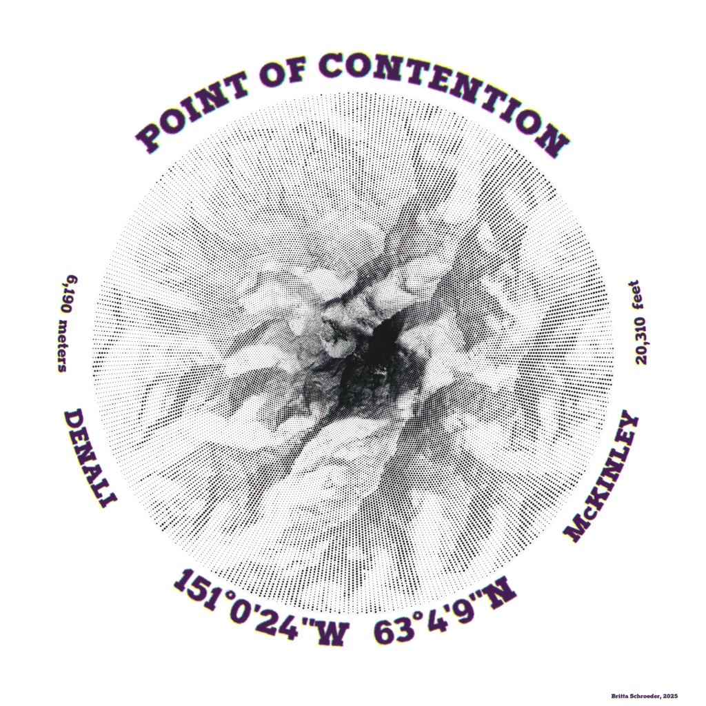
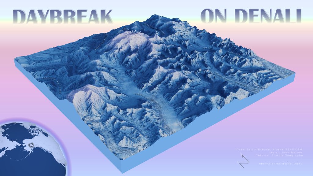
From afar, this map appears to be a solid hillshade around the highest peak in North America, but close up, one can see that the shading is comprised of graduated size halftones. Upon even closer inspection, the intentional misalignment and blending of the four CMYK colorways creates fuzzy boundaries. The pattern of dot distribution is radial from the summit of the South Peak, which has been the center of naming disputes for almost 130 years. The four colorways represent both the various names as well as the various categories of logic that are often used to defend each name (i.e., temporal, political, or geographic legitimacy).
In Pro, I ran a script in a Notebook that generated the dots by creating a gridded point mesh that lined up the points on radial lines generating outwards while also increasing point density per concentric ring. I then duplicated layers to mimic a halftone appearnace – dots that are either black, cyan, magenta, or yellow. I used graduated symbols based on hillshading values, and applied a slight offset and transparency to each point layer. Final touches were applied in Inkscape to round out the image.
- Tools: ArcGIS Pro, Python with Notebooks, Inkscape
- Data: Alaska 5m IFSAR DSM
- Font: Halftone
Day 2: Lines
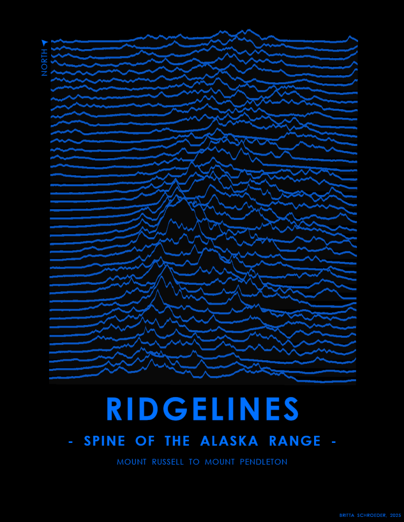
Joyplots were all the rage in cartographic circles a few years ago, so I finally tried my hand at it. However, instead of using the cartesian coordinates axes, I turned the lines Instead of aligning the XY axes of the graph to the XY cartesian coordinates of the map projection, I’ve draw the lines perpendicular to the spine of the Alaska Range, to emphasize the drastic elevation changes between the valleys and the peaks.
After creating a grid of lines spaced at about 1600 meters, I rotated, moved, and clipped them to the craggiest of peaks in the Alaska Range. Within the layout, I used a parallel perspective in a local scene. I left off a scale bar, since part of the appeal of joyplots is the minimalist, abstract aesthetic, and the axes are on two different scales due to vertical exaggeration and parallel perspective. In the future, I’d like to incorporate the name of each peak within the flatter portion of the line.
- Tools: ArcGIS Pro
- Data: Alaska 5m IFSAR DSM
- Tutorials: Each time I think I’ve come up with an original idea, I find out that Kenneth Fields or John Nelson have a tutorial on how to do it. https://www.esri.com/arcgis-blog/products/arcgis-pro/mapping/joy-plots-in-arcgis-pro
Day 3: Polygons
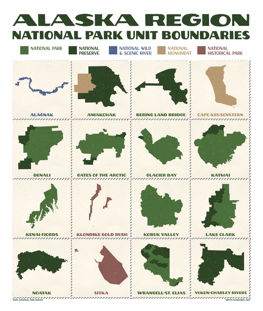
Collecting proof of a visit to a place is part of human behavior, and many visitors to National Parks carry a Passport Book to stamp a “cancellation” of the name and date of a visit to a park. Whenever I’m in uniform, visitors ask me where they can stamp their books at Denali (answer: Denali Visitor Center or Murie Science and Learning Center, Talkeetna Ranger Station, Denali Bus Depot, and the Kennels). This map is a compilation of individual map frames with each Alaska Region park unit boundary on a postage stamp. How many have you visited?
In Pro, each park required it’s own map to display in the appropriate UTM zone, to make the boundaries appear “correct” to a viewership who is not familiar with the slanted lines in an Albers Conic projection. I created the stamps and stamp book in Inkscape and then brought the exported JPEG into Pro.
- Tools: ArcGIS Pro, John Nelson’s WPA Poster Style, Inkscape
- Data: National Park Service
- Font: John Muir Sans (personal use license)
Day 4: My Data

I live in a tiny log cabin at the end of the road and am slowly restoring it. To document the improvements, each year I map my land with a UAS and use structure-from-motion software to generate a DSM and orthomosaic. For this map, I then interpolated a smoothed DTM from the DSM, as well as used supervised object-based classification to create land cover polygons. Lastly, I generated contours from the DTM and applied a style to show how far I’ve come – and to show the blood, sweat, and tears I have yet to shed – in improvements!
- Tools: DJI Phantom 4 Pro, Agisoft Metashape, ArcGIS Pro, Warren Davison’s Landscaping Style
- Data: Mine
Day 5: Earth

It isn’t much, but it’s my first time creating an interferogram! A few years ago, I had the opportunity to participate in a NASA flight collecting P-band Synthetic Aperture Radar and since then, I’ve wanted to better understand how to use this type of data. Technically, as a NASA DAAC, the Alaska Satellite Facility’s free on-demand cloud computing for SAR imagery did the heavy lifting for me, but I was finally able to take trainings to understand what the rainbow cycles mean and how to create my own.
- Tools: Alaska Satellite Facility HyP3 InSAR software, ArcGIS Pro
- Data: Sentinel-1 C-Band SAR SLC IW
Day 6: Dimensions
Stop me if you’ve heard this one before.
Park Cartographer: I’ve built a 3D model of Denali!
Mountaineering Ranger: To scale?
Park Cartographer: No, to look at.
This post is for my coworkers, who may not know the robust capabilities of GIS to render in 3D. Imagine what we could do with the rest of our Denali data, if we had more than just a day to do it!
Fads in GIS come and go much like fashion. I first went down the road of creating dioramas using Staridas Geography’s tutorial in 2022, though John Nelson also created some slightly different but still fantastic tutorials. I used a Skymodel from the Terrain Mapping Toolbox based on the azimuth and elevation of the sun at winter solstice with clear skies. To emphasize rock faces, I can the curvature tool and applied blend modes with the hillshade and elevation color ramps. This local scene in shown in a layout with a global scene for the locator inset.
- Tools: ArcGIS Pro, various John Nelson styles, Terrain Mapping Toolbox
- Data: Alaska IFSAR 5m DSM
- Tutorials: Staridas Geography
Day 7: Accessibility

The Americorps Youth Empowerment Stewards (YES) program places interns who have experience with identifying access needs in National Parks to improve our public spaces. Although the National Park Service provides accessible material in many different formats, this information isn’t often presented cartographically. This year, Denali plans to hire an intern to help catalog our geospatial data and create 508 compliant material for displaying access spatially, for a wide array of access needs. Position announcements will be posted here when available: https://lnkd.in/dMC7gpJR. In the meantime, here is a map of the Denali Visitor Center campus and just some of the information I would like to display spatially. You can read more about some of the ways the Park is made accessible for visitors: https://lnkd.in/dwb2jDds
This is simply a photo I took of the Denali park brochure map and used points, lines, and text to mimic a mockup in the layout of Pro.
- Tools: ArcGIS Pro
- Data: National Park Service
Day 8 : Urban
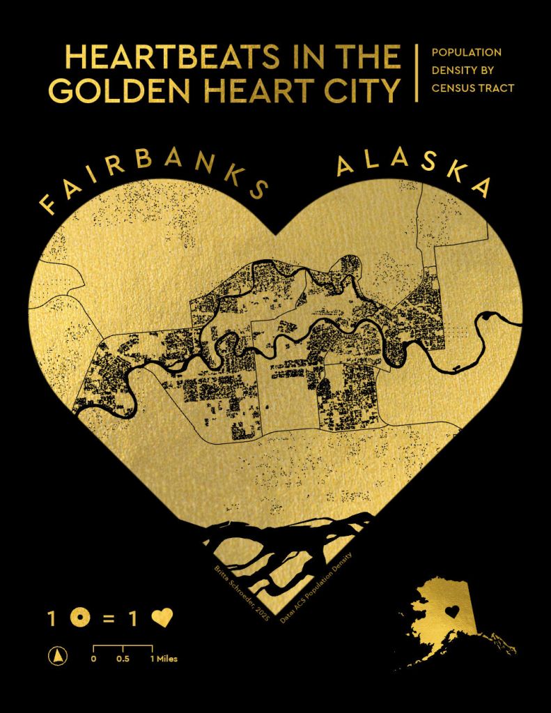
With about 29,000 residents and two hours away from Denali, the City of Fairbanks is about as urban as it gets North of the Alaska Range. Fairbanks is known as “The Golden Heart City” for its ties to the gold rush, its hospitable residents, and its geographic location as a hub for northern Alaska villages. One of my favorite things about this challenge was being forced outside of my comfort zone, as I would never intentionally seek out population data.
Here I’ve overlaid the transparent map frame on gold foil and masked the dot density by taxable parcels, since the vast majority of census tracts in the borough are undeveloped or natural areas. Improvements I’d like to make in the future would be adding “flakiness” on the edges, to mimic imperfections when imprinting with gold foil.
- Tools: ArcGIS Pro, Inkscape
- Data: U.S. Census Bureau’s American Community Survey (ACS) 2019-2023 5-year estimates, Fairbanks North Star Borough Tax parcels
Day 9: Analog

I made this heart chart 10 years ago for my now husband. He was the one to teach me how to read an aeronautical chart and my biggest supporter as I worked through my various licenses and ratings.
Given that the FAA updates charts about every 56 days, we have a lot of these maps floating around and still use old maps for things like wrapping paper – and 10 year anniversary cards.
- Tools🛠️: Printer, scissors, card stock
- Data🗺️: FAA aeronautical sectional charts
Day 10: Air

Q: How do you know if someone is a pilot?
A: They will tell you.
And one of the reasons that I am a pilot is because some of the best parts of Alaska are very difficult to access without a plane like a Super Cub. A few years ago, I took the logbook of a more experienced pilot than myself and created radial flow line 2D maps based on the gear of the airplane (floats, wheels, or ski/wheel-skis). *
For this map, I took the same data but was able to display it as a parabolic line in 3D with tapered lines. This required writing a script in Notebook to have line length determine the line height, then symbolizing lines as tapered polygons. I also increased vertical exaggeration in the global scene.
*Wildlife survey pilots don’t really go point-to-point as depicted on this map. You can read more on how I created this dataset and radial flow line 2D maps here: https://akmapplications.com/2024/02/04/one-if-by-land-two-if-by-sea-three-if-by-ski/
- Tools: ArcGIS Pro, Notebooks
- Data: Esri Imagery and Hillshade, tracklogs by B. Nigus from 2015 through 2021
Day 11: Minimal
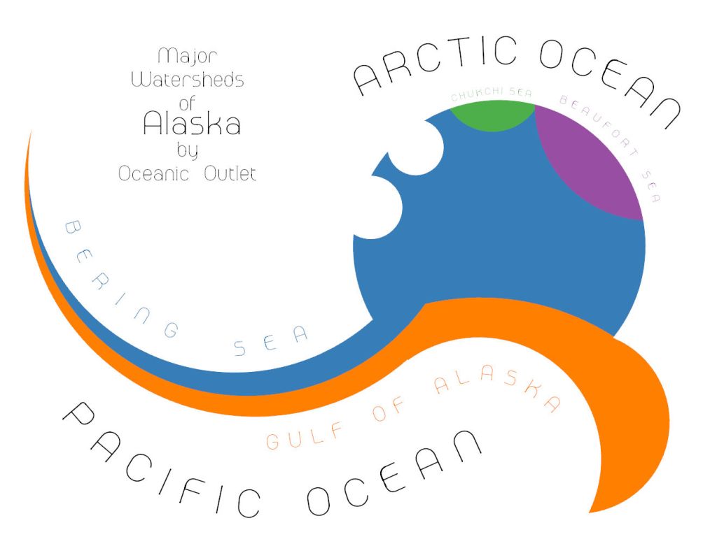
I’m always amazed at how watersheds in Alaska drain into oceans so very far away from the source. Especially in a place like the Alaska Range, where just a few feet makes the difference between draining to the Pacific or taking the long journey out to the Bering Sea.
I used watershed boundaries to help place seven circles for the various oceanic outlets and then ran the Union tool to merge and delete polygons, so only a handful of sections remained.
- Tools: ArcGIS Pro
- Data: NHD WBD
- Font: Melaround
Day 12: A map of 2125
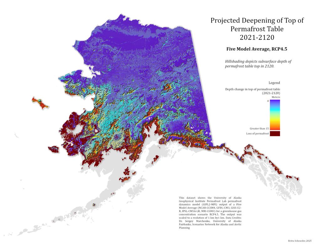
If you look closely, you can see that this is not digital elevation model hillshading. This hillshading depicts a subsurface – the depth in meters of the permafrost table in Alaska by 2120. The color ramp indicates the change in permafrost depth from 2021 to 2120. The pitted appearance is meant to convey a better concept of the impacts of climate change on Alaska than when similar data is draped on a digital elevation model. Emotionally, I also want to convey what it feels like to live on melting permafrost, as if the bottom is falling out below you. One of my job duties is to support climate scientists within the National Park Service, participating in field campaigns to collect data that is then shared with researches to generate models such as these. I know many others across the state who do the same, contributing to the giant datasets that created this model. It just goes to show, little actions can build up and make a difference.
With this challenge, I created a multidimensional raster layer from a mosaic dataset I created based on individual TIFF files. I masked areas of the state where there was no permafrost to being with, and then created individual rasters for areas where permafrost persisted and areas where permafrost was lost. For displaying, I created a hillshade and bumped up Z factor to 1000 to emphasize change in depth. I also manipulated the histogram of the color ramp to bring out areas of little change.
- Tools: ArcGIS Pro
- Data: Scenario Network of Alaska Planning GIPL Permafrost Model
Day 13: 10 Minute Map

This wasn’t the map I had planned to make, but when I downloaded the “Continental US” datasets for my intended map, Alaska was missing in each one. If it feels absurd to see the rest of the US left off a map labeled as such, then I hope this map serves as a reminder to label maps correctly. As silly as I feel saying this, it seems not everyone is aware: Any map labeled just “United States” should include both Alaska and Hawaii. Alaska is part of the “Continental USA”, while Hawaii and Alaska are not part of the “Contiguous USA”.
- Tools: ArcGIS Pro
- Data: Moriarty Hand from Project Linework
Day 14: OpenStreetMap
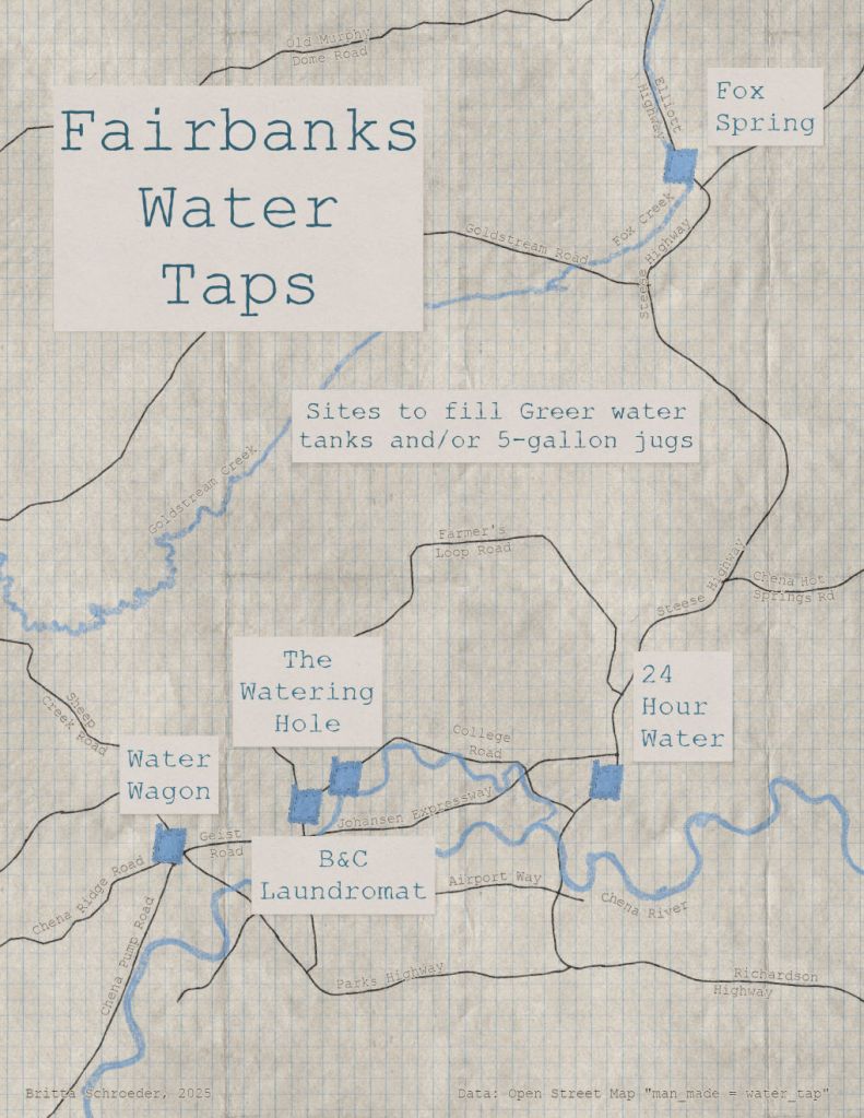
Plumbed water in Interior Alaska is hard to come by, due to the costs and logistics associated with maintaining running water at -40 degrees F. Many communities maintain a public wellhouse for filling jugs and tanks, to haul back to cabins without plumbing. A city as big as Fairbanks has quite a few water taps and one of the first things a newcomer to Fairbanks most likely needs to know is the location of these water wells. The idea for my OSM data edit and map came from my good friend in Fairbanks, who needed a map like this when she first moved to town.
My friend used Google Maps to identify areas of known water taps and we then went around town to verify these points. I updated the sites in OpenStreetMap using a login I haven’t accessed since 2013! After that, I used Overpass Turbo to extract these locations as JSON files and in Pro, converted the JSON files to features. Something about these features caused continuous crashing of Pro, so I abandoned the map, but in the future, I would use QGIS with the overpass turbo plug-in.
- Tools: ArcGIS Pro, Warren Davison’s Field Notes style, John Nelson’s Sampler style
- Data: Open Street Map
Day 15: Fire
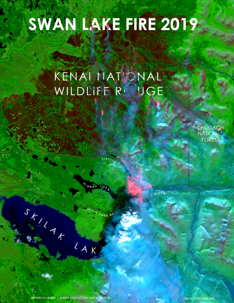
Since 2004, I’ve worked on fire assignments as a NWCG Firefighter Type 2 (FFT2), GIS Specialist (GISS), UAS Data Specialist (UASD), and UAS Pilot (UASP). I was on a different fire assignment at the time the Swan Lake Fire jumped the highway in August 2019, but the Sentinel-2 imagery timed the moment perfectly.
This was my favorite map because the smoke and fire appear to be burning over the vector data. I started with creating a STAC connection to Copernicus and used filters to add the images and bands I wanted to a mosaic dataset. I displayed the imagery based on Red channel:B12 (SWIR), Green channel:B8A (NIR), and Blue channel:B4 (Red) to emphasize the smoke and fire, while also compressing the green and blue histogram and stretching the red channel histogram. I used band arithmetic [(B2+B4)/(B8A+0.0001)] to identify bright areas on the map to create a smoke mask. After remapping and then converting to a polygon, I used the smoke mask to mask annotation and other vector data on the map.
- Tools : ArcGIS Pro, Copernicus STAC Connection tutorial
- Data : Sentinel-2, USFWS, AK DOT
Day 16: Cell
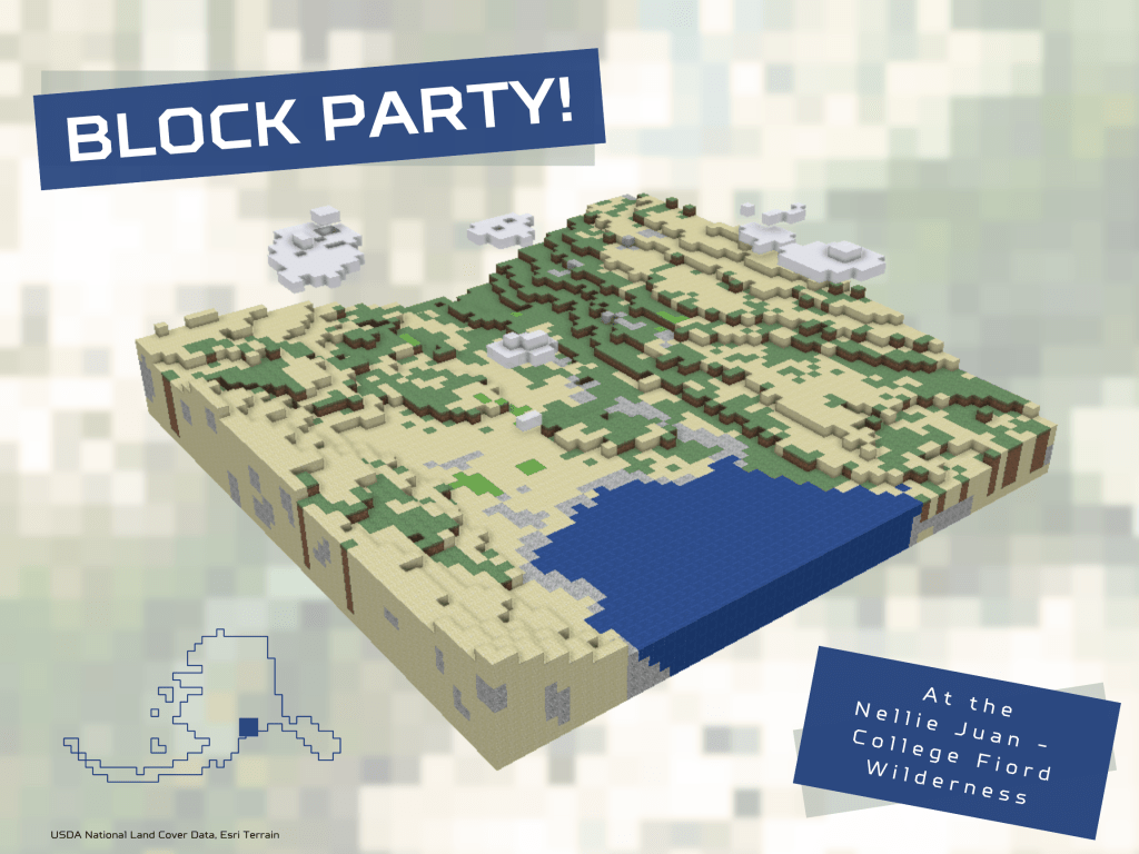
I so rarely get to indulge in over-the-top stylized maps that I’ve enjoyed going all out during this challenge. Wes Jones and Craig McCabe’s gateway to procedural rules definitely took me down a rabbit hole of rule packages and City Engine.
The only places I differed from the tutorial is by 1) using existing 30 meter landcover data, and 2) having AI come up with a script that would create additional points below the surface in 30 meter blocks down to a set elevation. My favorite part was manually adding in the clouds. It would be interesting to animate a rendering from the bottom up, block by block; however, currently the script I used builds a base from the top down.
- Tools: ArcGIS Pro, Python in Notebooks, Canva, ChatGPT for subsurface script
- Data: USDA National Land Cover Data, Esri Terrain
- Tutorial: https://lnkd.in/dMxKndvA
Day 17: A New Tool
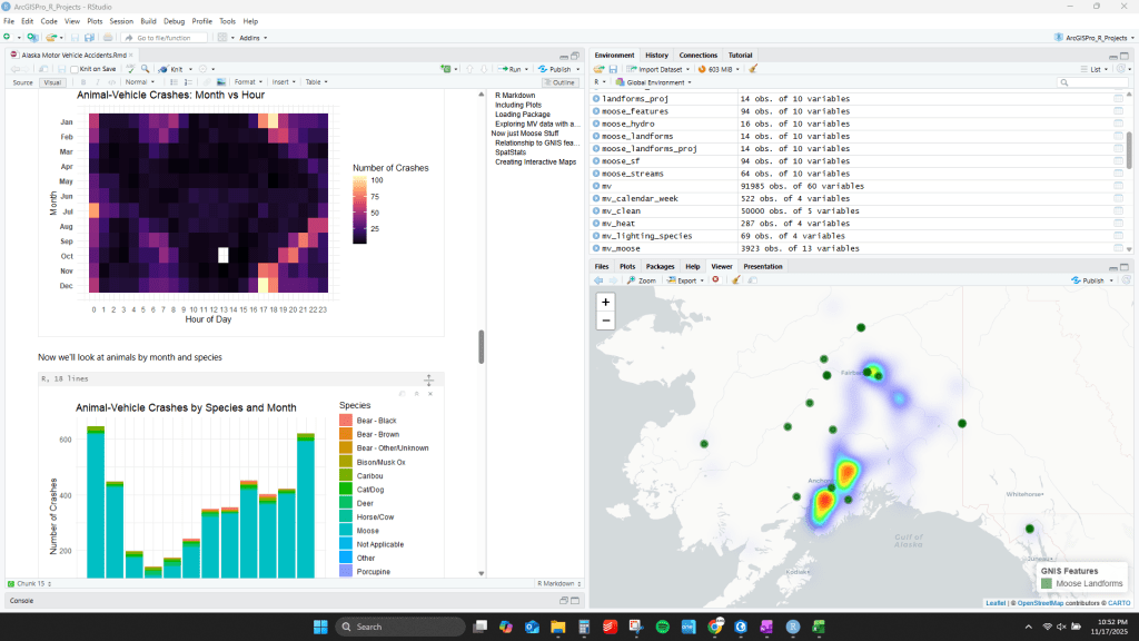
Are there more motor vehicle-moose crashes in areas with “Moose” in the place name? One thing I have wanted to explore more in-depth is the R-bridge tool for ArcGIS Pro and Space-Time Cubes. For my master’s, I relied heavily on the r-spatstat library, and was frustrated with the clunky Arc>R>Arc workflow. I’ve been interested not only in creating beautiful data viz products but also utilizing the power of the statistical libraries in ArcGIS.
Here I wrote a R markdown document in R Studio to create curtain plots, bar graphs, and heat maps of moose-vehicle accidents and GNIS place names with “Moose”. I also used ArcGIS Pro space-time cube tools to create and investigate a space-time cube in 3D. More to come on this rich dataset.
- Tools: Rstudio (arcgis, leaflet, spatstat), ArcGIS Pro
- Data: AK DOT Motor Vehicle Crashes, GNIS Landforms
Day 18: Out of this world

This is a sneak peak of a map I’ve been working on this fall with lots of improvements remaining.
I wanted to convey the sense of wonder I feel when viewing the world through a different lens than my own, while also honoring the astronomical knowledge shared by Gwich’iin Dene speakers. You can read more about the Yadhii constellation and star names here. This image is based on information published by Dr. Chris Cannon from the University of Alaska Fairbanks. Dr. Cannon recently published a book describing The Traveler, and all author proceeds go back to supporting Northern Dene language programs. Any mistakes on this map are mine.
It was difficult to figure out how to display both the ground as one would view it from above as well as the sky as one would view it from below. The ground is a global scene while the sky is a 2D map. I have a lot of work left to do on this map to do the subject justice.
- Tools: ArcGIS Pro
- Data: Star data – Night Sky Star Chart; Yadhii data – Chris M Cannon et al., “Yellowknives Dene and Gwich’in Stellar Wayfinding in Large-Scale Subarctic Landscapes.”
Day 19: Projections
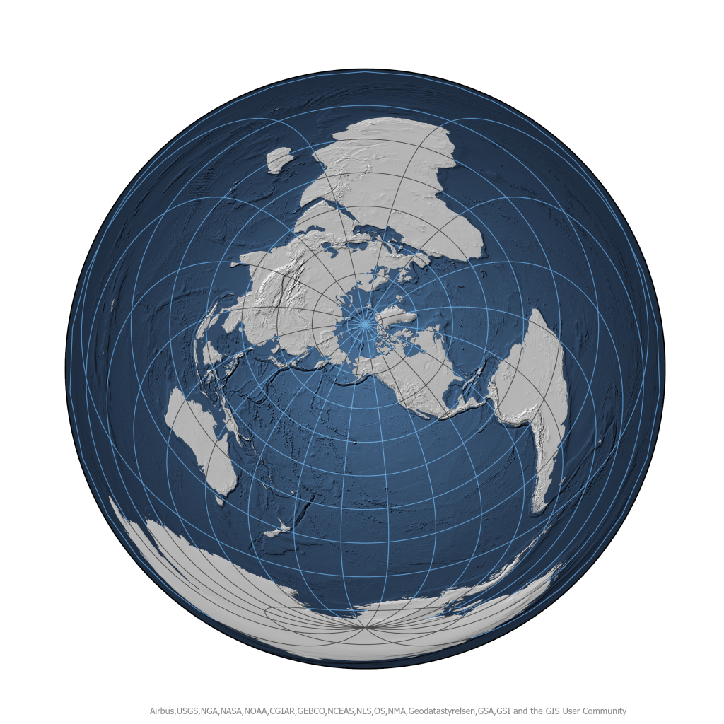
Whenever my supervisor introduces new employees to Denali, his opening line is always “Welcome to the center of the universe!” Sometimes, I think he really means it. Working at the Park can feel like the foci of excitement in the summer. Admittedly, I was running out of steam and time by this day, otherwise I would have gone a different route with this fun map.
This map is azimuthal equidistance projection to imitate a map centered on Denali. Alternating land/ocean graticule from John Nelson.
- Tools: ArcGIS Pro
- Data: Natural Earth, Esri
Day 20: Water
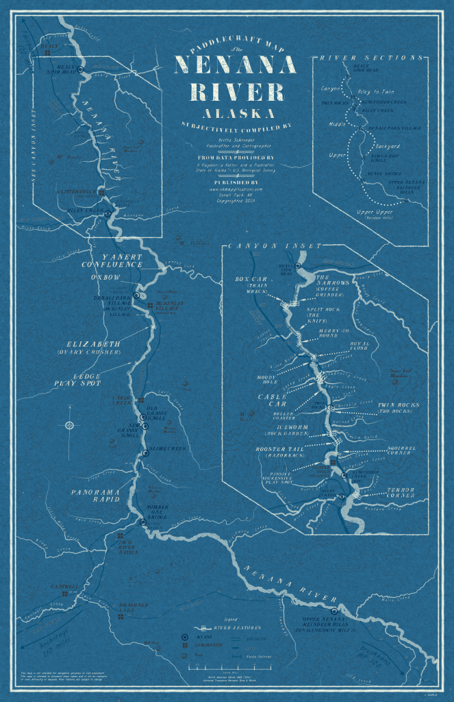
The Nenana is a popular river to raft here in the Interior of Alaska, since much of it is accessible by road and is usually Class II-III. Because it is in our backyard, many of us will float a section after work, and it was on one of these floats that the idea for this map came to me. This August, a packraft race took place along a 50-mile stretch of the river and I donated this map as a prize. So, this map is also a little bit of a cheat because I made it before today. If this map looks familiar, it’s because it leans heavily on Warren Davison’s knowledge and styles.
You can read more about the process of creating this map here. This was the only Pro project I’ve ever corrupted. Thankfully, I could change the .aprx extension to .zip and extract the .json files to rebuild the layer symbology, which is a long, ongoing process.
- Tools: ArcGIS Pro, Warren Davison’s Flow Map Style https://lnkd.in/dAU6gVtc
- Data: NHD
Day 21: Icons
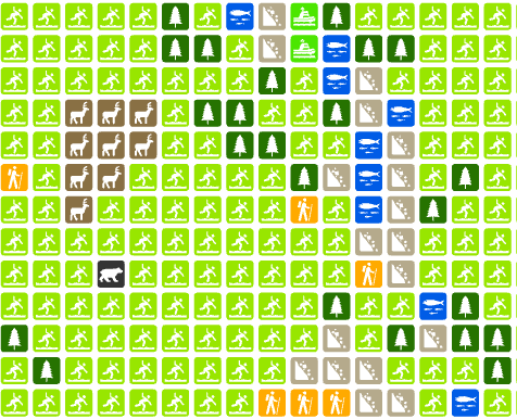

When I think of icons (and the iconic), I can’t help but think of the National Park Service and its Crown Jewel, Denali. Park brochure map icons are ubiquitous and often universally understood. They also happen to be free and available for public use from Harpers Ferry Center. In this map, I started with GP tools to convert land cover, trails, roads, and facilities to icon points and then added various icons manually (lots of little Easter Eggs for my co-workers). Although I changed the colors, I only created one new icon – can you guess which one?
One other bonus I learned with this map: STYLX files are just SQLite databases. I wanted an easy way to choose the symbol from a drop down in the attributes of each feature, so I exported a list of style point names from PostgreSQL as a CSV. I then converted the CSV to a domain using the Table to Domain tool and assigned the domain to a “Symbol” field within my point table. This made assigning symbols a breeze.
- Tools: ArcGIS Pro, NPS Esri Style
- Data: National Park Service, USDA NLCD
- Font: BellTopo Sans
Day 22: Natural Earth
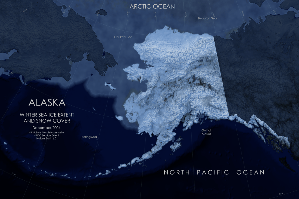
The sun has set for the next few months here, and as I was watching more snow fall this morning, it dawned on me that there was something unnatural about Natural Earth hypsometric/satellite data, at least from the perspective of most Alaskans. Any statewide sunlit map with vivid vegetation depicts a beautiful but very brief window. Here I tried to capture how the state looked today and most of the winter: dark and snowy.
True to the prompt, I used the Natural Earth data, but from Tom Patterson’s Natural Earth 6.0 version. This map involved another server connection to find a high-resolution mosaic of Blue Marble data, along with the sea extent data. I overlaid a blue gradient hillshade from Natural Earth with the NASA imagery to emphasize the snowiness.
- Tools: ArcGIS Pro
- Data: Natural Earth 6.0 data with a NASA Blue Marble composite and NSIDC sea ice extent in December 2004
Day 23: Process
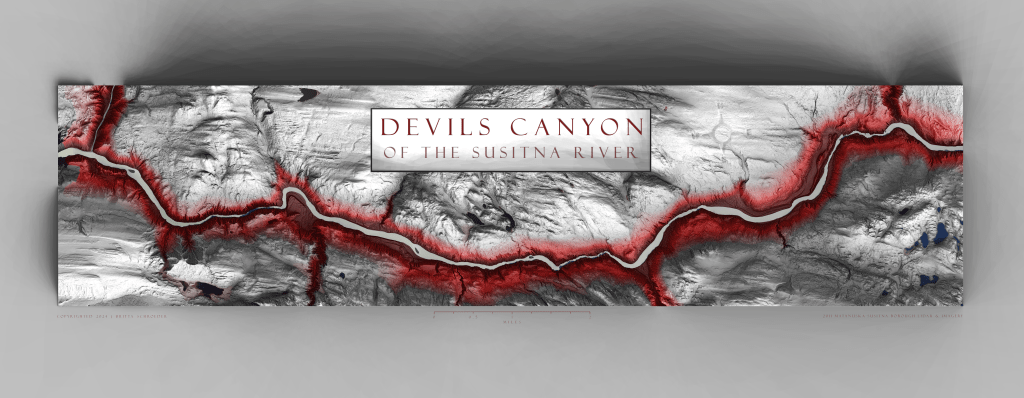
Way back when I was new to the NPS, I reached out to Tom Patterson about how to use the texture shading tool on the DEM of a place called Devils Canyon. He helped me through it, and it worked but was too much work. About 10 years later, I was able to revisit making a map of the same area using only ArcGIS Pro. My favorite thing about this map was retaining the imagery of the water to show the rapids in the canyon.
Read more about how to make a map that looks like Blender and Texture Shading/Illustrator tools with just ArcGIS Pro: https://akmapplications.com/2024/03/01/the-devils-and-the-details/
- Tools: ArcGIS Pro
- Data: Susitna Lidar DTM and Imagery
Day 24: Place Name
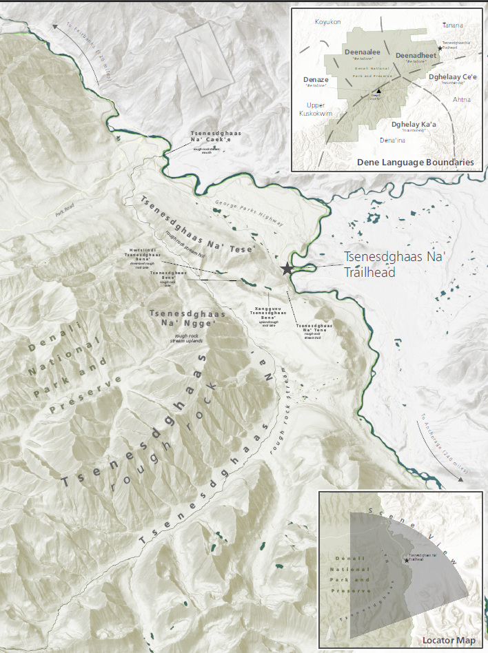
This summer, Denali held the grand opening of a wayside trailhead on the south side of the park, which was given the Ahtna name Tsenesdghaas Na’ (pronunciation here), translating to “rough rock stream”. According to Alaskan linguists who have compiled statewide datasets, Dene languages often use clustering, taking a prominent feature, such as tsenesdghaas (“rough rock”) and using geographic nouns around it (e.g., “stream”, “lake”, “glacier”) to emphasize the prominence and assist in memorization. This map went through tribal consultation and a version of it is now in a kiosk at the wayside.
One interesting thing I learned during the creation of this map was the ability to import a custom dictionary as a CSV for use in ArcGIS Pro to avoid spelling errors.
- Tools: ArcGIS Pro
- Data: Alaska Native Place Names Atlas (Smith, Gerad, and James Kari. 2023. The Web Atlas of Alaska Dene Traditional Place Names. ArcGIS Storymap, published online November 15, 2023)
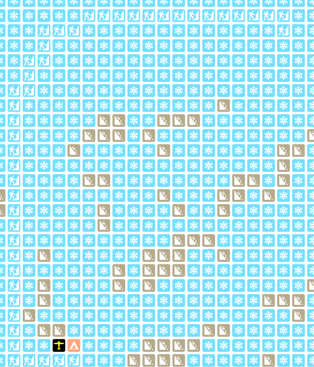
Day 25: Hexagons
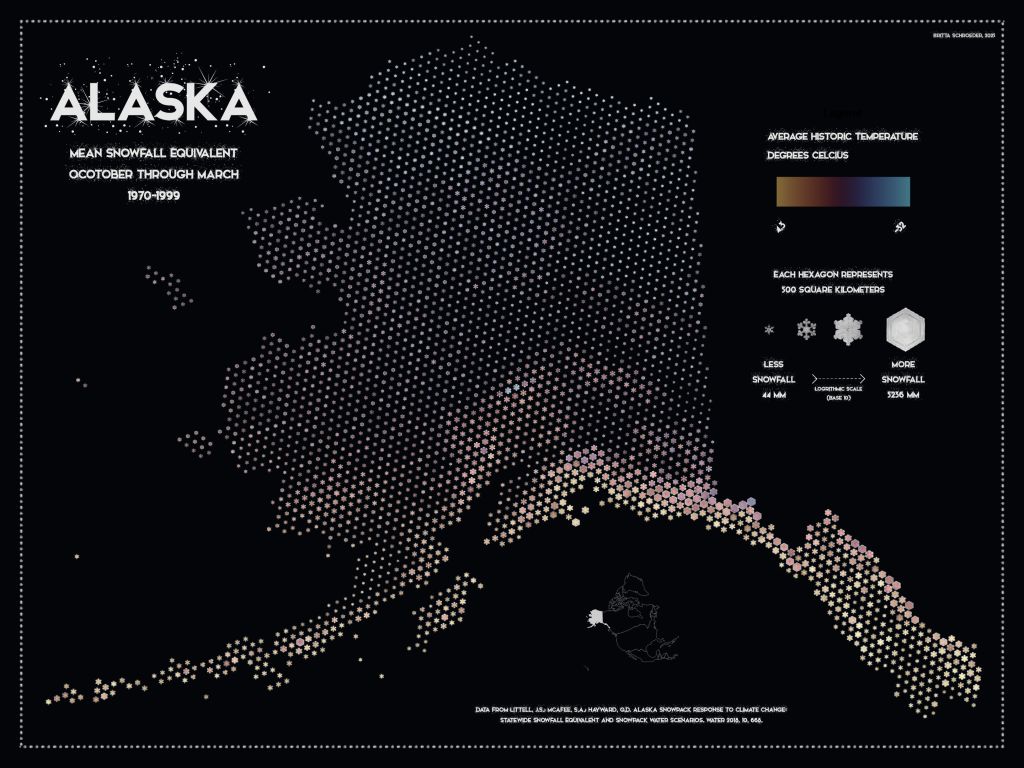
More snow! This map takes advantage of a great style and tutorial from Kenneth Fields, who painstakingly edited 100 snowflakes to create a binned snow depth map, symbolized by design and size to avoid using a rainbow color ramp. Unfortunately, the lower 48 weather datasets used in the tutorial aren’t available for Alaska. So instead I again relied on my good friends at SNAP, who have a model of historic snowfall equivalent. Snowflake design is related to temperature and humidity, not amount of snowfall, but that is for another day. To add some irony, I still included a color ramp for temperature.
- Tools: ArcGIS Pro
- Data: Scenario Network for Alaska Planning
- Tutorial 📃 : Kenneth Fields
- Font 🆎 : Snowinter
Day 26: Transport

I feel like a broken record with snowy maps, but winter in Alaska is when the country opens up for much easier travel than in the summer. Here’s a work-in-progress snow trail map for mushers, skiers, and some snowmachiners that I’ve been struggling with for a few years now. Mainly, how to display open space for off-trail exploration/orientation while maintaining a balance of white space in the layout. This is a small segment of a much longer corridor map.
- Tools: ArcGIS Pro, Terrain Mapping Toolbox
- Data: Myself and various neighbors who have agreed to collaborate on this map
Day 27: Boundaries

This day coincided with Thanksgiving, so I set a boundary of stepping away from the computer to be present for the holiday. I’m very grateful that my loved ones still indulged my love for maps with our holiday activities.
Day 28: Black
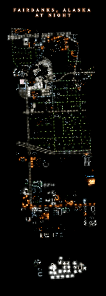
Many ecosystems thrive on dark night skies, and the National Park Service works to restore and protect nocturnal habitats and species across the nation. However, existing remote sensing tools like satellite imagery are often too coarse to identify point sources of light pollution at a management-level scale, which is where the fixed-wing comes in. This spring I will be assisting the Gulf Islands National Seashore with fixed-wing flights to maps landscapes for night sky restoration, with the end goal of improving dark night skies for sea turtle habitat. You can read more about sea turtle hatchling needs for night skies here: https://www.nps.gov/guis/learn/nature/seaturtle-threats.htm
This image shows the lighting – or lack of lighting – over a small swath of Fairbanks, Alaska during our initial test flights and some of the cool snow and lighting patterns we saw from the air.
- Tools: Agisoft Metashape, ArcGIS Pro
- Data: National Park Service
Day 29: Raster
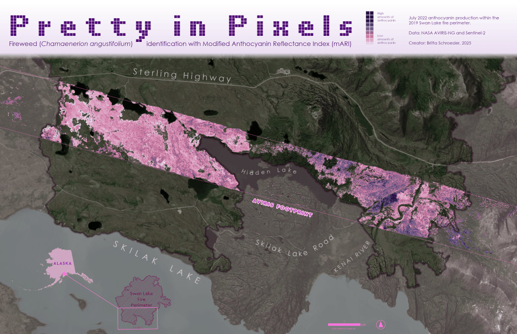
Is it possible to use hyperspectral data to identify fireweed superblooms after a fire?
On the long drive home from Homer after Thanksgiving, we passed through the 2019 Swan Lake burn scar (Day 15: Fire). In the years following the fire, there has been vivid succession by an anthocyanin-rich purple flower that is aptly named “fireweed”. In 2022, a superbloom event of fireweed was captured by a NASA AVIRIS-NG hyperspectral mission. I used the spectrometry data in conjunction with Sentinel-2 imagery from before and after the fire to create burn severity and vegetation indices for identifying areas of likely fireweed patches. The masks were then applied to the bands used in the modified anthocyanin reflectance index (mARI) to highlight areas of high anthocyanins.
Is this a scientifically sound method? Doubtful. Is this a pretty, pretty pixel map? 💅🗺️
- Tools: ArcGIS Pro, Notebook
- Data: NASA AVIRIS-NG and Sentinel-2
Day 30: Makeover
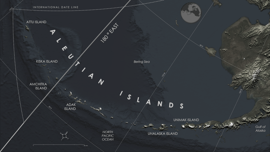
The Iditarod has an award called “The Red Lantern” for the final finisher of the race and it is bestowed to honor, not shame, the endurance of the dogs and mushers. In that spirit, I will proudly carry up the rear as I finish this map challenge.
This last map in the map challenge is more a redo than a makeover, since I wasn’t pleased with Day 19 (projections) and Day 27 (boundaries). Additionally, I feel I must atone for my iniquities against the Aleutians, which were left off a few Alaska maps due to scaling. This map shows both the dateline boundary as well as the US/Russia boundary and the meridian that splits the eastern and western hemisphere.
- Tools: ArcGIS Pro
- Data: Esri imagery and Natural Earth terrain
Wrap Up
Over the course of one month, by participating in the challenge, I felt that I advanced my GIS skills more than I have in many years by exploring many new topics: machine learning with object-based image classification, Synthetic Aperture Radar interferometrics, multi-dimensional/multi-variate data, space-time cubes, deep learning for object detection and classification, hyperspectral data analysis, STAC connections/catalogs, R-bridge and R-tools, Notebooks, and procedural rules.
Additionally, I was able to step back from data management and critique each product with an artistic eye that made me realize how much I have yet to learn in graphic design – specifically Blender and Adobe Illustrator, which is what I plan to devote much of my winter towards.

You must be logged in to post a comment.